On January 2, 2020, Johns Hopkins University launched one of the first digital maps to track the number and locations of COVID-19 cases and deaths around the globe. By March 3rd, they had launched the Coronavirus Resource Center (CRC), a continuously updated source of COVID-19 data (tracking cases, deaths, tests, hospitalizations, and vaccines) designed to aid in pandemic response. The CRC quickly became the go-to data source for mapping the virus, both for individuals as well as for medical professionals, governments, policymakers, and the media. The creation and use of maps and data-visualizations as responses to outbreaks of disease, global pandemics, and public health crises is not, however, a new phenomenon. As Tom Koch explains in Cartographies of Disease: Maps, Mapping, and Medicine, “for most of the last three hundred years the vast majority of maps made in service of medical knowledge have been of epidemic or pandemic conditions that were a signal threat to the lives and health of thousands, in and some cases millions of people” (10).
The maps included in this introductory section all represent attempts to map and to visualize the geographic location, statistical presence and/or the spread of illnesses and diseases; they also serve as graphic representations of the knowledge, mindsets, and concerns of the eras in which they were created. From a sixteenth-century map of the world featuring diseased windheads blowing southern plague winds (working on the medical assumption of the day that sickness was in the air) to nineteenth-century statistical atlases comparing rates of disease in different regions of the United States, to a colorful and grotesque twentieth-century Life Magazine world map of major tropical diseases featuring the world’s continents covered in flies, rats, mosquitos, ticks and other symbolic representations of the presence of a disease—each map attempts to help the viewer visualize and understand complex medical phenomena on both local and global scales.
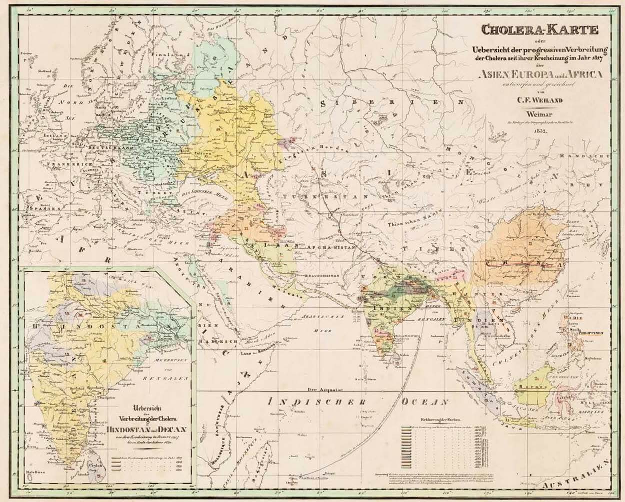
The most frequently mapped disease, certainly throughout the nineteenth century, was cholera, which resulted in the death of millions of people around the world. While Dr. John Snow’s 1854 mapping of the London cholera epidemic is more well-known, Carl Ferdinand Weiland’s German map, hung on the left wall, predates Snow’s map by twenty-two years. Weiland’s map, created in the midst of the Second Cholera Pandemic (1827-1835) shows the geographic spread of cholera across Europe and Asia and into Africa, beginning in Bengal in 1817, and tracks annual spread through color-coding, as well as highlighting disease vectors like ships. It was Snow, however, in 1854, who, through the use of mapping, first made the connection between contaminated water sources and the presence of cholera, and thus reconceptualized the myriad ways in which mapping can serve to help us to better understand health and the presence and spread of disease.
As data visualization became a more prevalent tool, mapping the presence and spread of disease became increasingly common in the nineteenth and twentieth centuries, as evidenced by the statistical atlas maps based on census data and the map of lung disease in Washington, D.C. Like the current COVID-19 pandemic, many factors were included in the historical tracking of the presence, spread, and impact of disease, including race, as you can see on the map of Washington, D.C. Grave disparities continue to exist in access to preventative medical care, health insurance, treatments, and vaccines. Maps can help to highlight and document these issues, even if they cannot directly solve them.
Carl Ferdinand Weiland
Cholera map; or, overview of the progressive spread of cholera since its appearance in 1817 across Asia, Europe and Africa, 1832.
Osher Map Library Sheet Map Collection
https://oshermaps.org/map/49239.0001

United States Census Office
Number of deaths of various diseases per 1000 deaths from known causes, in: Statistical Atlas of the United States: based upon the results of the eleventh census by Henry Gannett, 1898.
Osher Atlas Collection
https://oshermaps.org/map/8078.0077

Julius Bien, United States Census Office. 9th census, 1870.
Map showing the proportion of deaths from malarial diseases to the deaths from all cases compiled from the returns of mortality at the ninth census of the United States 1870, in: Statistical Atlas of the United States based on the results of the ninth census 1870: with contributions from many eminent men of science and several departments of the government comp. Under the authority of Congress by Francis A. Walker, 1874.
Osher Atlas Collection
https://oshermaps.org/map/3690.0077

District of Columbia Health Department
Map of the city of Washington showing location of fatal cases of acute lung diseases for the year ending June 30, 1900, 1900.
Osher Map Library Sheet Map Collection
https://oshermaps.org/map/55071.0001

Frisius Gemma
Typus Universalis Terrae juxta Modernorum Distinctionem et Extensionem per Regna et Provincias, 1583.
Osher Sheet Map Collection
https://oshermaps.org/map/318.0001

Boris Artzybasheff (for Life Magazine)
World Map of the Major Tropical Diseases, 1944.
Osher Map Library Sheet Map Collection
https://oshermaps.org/map/54290.0001
