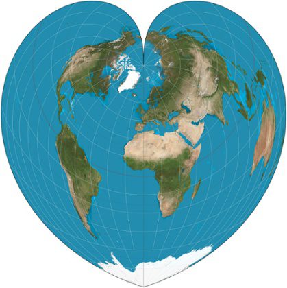

The (London) Guardian had a great piece in yesterday's newspaper on the representation of Africa in early and modern maps. Give it a read!
The essay, by James Wan, originally appeared in the blog Think Africa, and explores the persistent ways in which the continent has been short changed. More generally, it points to the problems caused by Google Maps' use of the Mercator projection for displaying the world. There is no algorithmic reason for Google to use the Mercator projection; in fact there are several mathematically simpler and graphically less distorting projections that the internet giant could have used, and Wan demonstrates some options, each of which shows Africa in better light.
Wan, James. “Why Google Maps Gets Africa Wrong: From Colonial Cartographers to Digital Depictions the Continent is Being Sold Short.” Guardian (2 April 2014), http://www.theguardian.com/world/2014/apr/02/google-maps-gets-africa-wrong.